First, I'll quote that post I made in another thread:
The M&L in-game art has been feeling a bit off to me lately. I guess everything just feels unnecessarily big and spread-out in BIS. Sprites are high-res, but with no added detail; they're just big. The sprites and the map layouts in SS felt much tighter and less clumsy.
I also don't like how the series has become less stylistic. In SS, everything was drawn in an original style, but in PiT and BIS, all the sprites feel like they're just traced from the 3D renders.


It's also noticeable in the color scheme -- M&L had a rather distinct palette, giving it a coherent, unified theme, while PiT and BIS just use the big bright official colors for everything, and it's just kinda all over the place.

 For some reason, though, PiT and BIS turn Luigi blue. But the dancing is still good.
Hopefully a sprite-based console version would get them thinking more stylistically again.
You know, I'd really like to see a game (maybe an RPG) based on the cartoons and comic books. Except good.
I was reminded of this when I saw just now that
Paper Mario 3DS is now apparently changing the Dry Bones to look more like they do everywhere else. Observe:


This probably shouldn't annoy me as much as it does, but it does. I mean, is it just me, or are all the Mario games starting to converge a little too much?
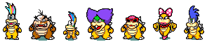
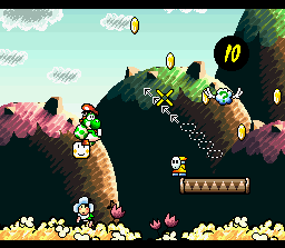
Compare the Koopalings in
Superstar Saga to their unused sprites in
Super Princess Peach (which, incidentally, is possibly the most graphically generic Mario game yet):

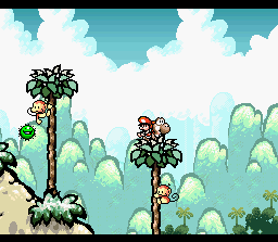
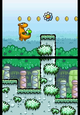
Or how
Yoshi's Island DS smoothed out all the pixels and made things just too smooth, largely removing the pen-and-ink-and-crayon motif. Kinda like when they try to restore old black and white movies to put them on DVD using algorithms to find and erase all the dust on the film, and the algorithm goes too far and ends up erasing all the film grain too and it doesn't look like film anymore, it just looks like overly smooth, generic video.


In addition to the standard enemies all looking the same,
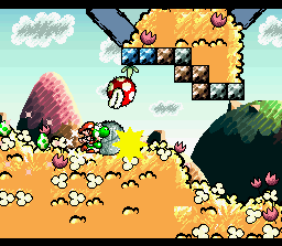
Bowser's Inside Story,
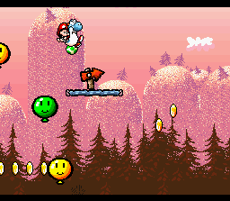
Super Paper Mario,
Yoshi's Island DS, and
Super Princess Peach also all seem very proud of the fact that they are at higher resolutions than SNES games, and therefore can make bigger smoother images without pixelization. And so that's all they do is make stuff that's not pixelated. I miss pixels.
It's in the 3D games too. When
Galaxy came out, I liked that we had a 3D Mario game where everything looked the way it was supposed to, but now, I'm actually starting to miss
Sunshine's uniqueness. And I've never like
Sunshine's graphical style. But at least it had a style. And is there any more generic-looking Mario game than
NSMBWii?
I'm overreacting a bit, but back me up on this, guys. Isn't it all starting to look too standardized? Too samey?


